
10 Exhibition Signage Examples That Work
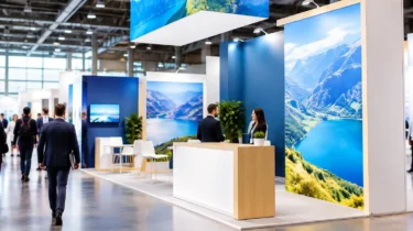
A visitor may give your stand three seconds before deciding whether to stop. The strongest exhibition signage examples do more than fill wall space with logos: they make the offer clear, guide visitors through the stand and give the sales team a practical setting for conversations.
The right mix depends on your stand size, venue rules, audience and how often the display will be used. A compact shell-scheme space needs a different approach from a large modular stand at a national trade show. In both cases, signage should be planned alongside flooring, electrics, counters, screens and product displays, not added when artwork is already at print.
1. Branded backwall graphics
A backwall is usually the largest uninterrupted surface on an exhibition stand, so it should establish your brand and proposition quickly. A tension-fabric backwall creates a clean, premium finish with no visible panel joins, making it particularly effective for a hero image, a concise campaign message or a product-led graphic.
Keep the main statement legible from the aisle. Long paragraphs, small feature lists and dense technical diagrams rarely work at viewing distance. If detailed information matters, place it on a counter graphic, product board or take-away literature where visitors can engage with it at their own pace.
For regular exhibitors, reusable tension-fabric frames with replacement printed skins offer a sensible balance of impact and flexibility. The frame can travel from event to event while graphics are refreshed for a new launch, sector or campaign.
2. Modular stand fascia and overhead signs
On a busy exhibition floor, being visible above shoulder height matters. Fascia graphics around a modular structure can carry your logo and key message on open sides of the stand, while overhead signage helps visitors locate you from further down the hall.
This is one of the exhibition signage examples where venue regulations need to lead the design. Height limits, rigging permissions, sightline requirements and fire-rating specifications vary by organiser and venue. A sign that looks straightforward in a visual can involve approved rigging points, electrical provision and advance-order deadlines.
A T3 modular system is useful where a business needs a more substantial branded environment without committing to a single-use build. Tool-free frames can be configured for different footprints, with graphics, shelves, meeting areas and storage integrated into the plan.
3. Welcome signs at the stand entrance
A clear welcome sign gives visitors immediate reassurance that they have reached the right place. It is particularly useful at conferences, recruitment events and roadshows where delegates may be looking for a booked meeting, a demonstration area or a specific session.
The sign might simply carry a logo and stand number, or it can set the agenda with a short instruction such as “Book a demo”, “Ask about our new range” or “Collect your event guide”. Position it where it can be read before someone steps onto the stand. If your team is expecting high footfall, use the entrance message to direct visitors towards registration, product demonstrations or a dedicated consultation area.
4. Product information boards
Products with technical features, multiple variants or compliance credentials often need more explanation than a backwall can provide. Rigid signage boards allow you to place focused information beside the product itself, helping visitors understand what they are looking at before a conversation begins.
Foamex is a popular option for lightweight indoor boards, while DiBond offers greater rigidity and durability for repeated use. Acrylic can provide a more refined finish for premium product displays, directional signs or reception-style areas. The material should reflect the setting as well as the budget: a short indoor event may not require the same specification as a display that will travel around the UK for a year.
Aim for one job per board. A comparison chart, product benefit statement, technical specification and case study all competing on one panel will slow readers down. Separate the information into a sequence that supports the sales conversation.
5. Freestanding directional signage
Even a well-designed stand can feel confusing if visitors cannot see where to go. Freestanding signs are useful for dividing larger spaces into clear zones, such as product areas, meeting spaces, hospitality points or demonstration stations.
They also help event organisers and venue teams manage visitor flow at registration desks, seminar rooms and temporary activations. Correx boards can be a cost-effective choice for short-term directional signage, particularly where many signs are required. For a more permanent or polished appearance, printed panels in a branded frame or display system may be better suited.
Directional signs need plain language. “Demos”, “Consultations” and “Reception” are more useful than internal campaign names that mean little to a first-time visitor. Keep arrows consistent and make sure their direction is correct once furniture, counters and access routes are installed.
6. Branded counters and reception graphics
A counter is often the first physical point of contact on a stand. It can greet visitors, hold a laptop for lead capture and provide storage, but it is also valuable signage real estate. A branded counter front reinforces your identity at eye level and gives staff a defined place to start conversations.
For portable events, a lightweight counter with a printed graphic wrap can be packed efficiently and reused. On a larger stand, the counter can be integrated into the modular structure with power for devices and concealed storage for brochures, stock or personal items.
Avoid treating the counter as an afterthought. Its graphic should match the main display artwork, and its position should not obstruct the entrance or create a queue across the aisle. Where lead capture is central to the event, plan cable routes and electrics before build day.
7. Floor graphics that guide the visitor journey
Floor graphics can be effective when they are used with restraint. They can lead visitors from an entrance to a demonstration point, mark a photo opportunity or define zones within a larger activation. They are most useful where the visitor journey is deliberate rather than casual.
The practical detail matters here. Venue-approved, slip-resistant materials and correct installation are essential, especially in high-traffic halls. Flooring choices also affect the result: a vinyl graphic may behave differently on carpet, hard flooring or raised exhibition decking. Confirm the surface, removal requirements and permitted adhesives before production.
8. Demonstration and screen-area signs
Screens attract attention, but visitors still need to know what is being shown and why it is relevant. Signage around a demo area can frame the content with a product name, a short benefit statement and a clear call to action. This is especially helpful when the screen is playing without sound or when several people are waiting for a demonstration.
If the presentation depends on internet access, check venue connectivity early. A visually strong demo station can fail operationally if the required internet service, power supply or cable management has not been arranged. The same applies to screens mounted within structures, where loadings and fixing methods must be considered in the stand plan.
9. Case study and proof-point panels
Visitors often respond more readily to evidence than claims. A case study panel can show the client challenge, the solution and the measurable result in a format that a sales representative can reference during a conversation.
Use recognisable proof points: delivery times reduced, sites supported, costs saved or performance improved. A customer quote can add credibility, provided it is short and approved for use. These panels work well in meeting areas, where visitors have more time to read than they do in the aisle.
For businesses exhibiting across several sectors, replaceable case-study graphics are more practical than rebuilding the whole stand. The core framework remains the same while the supporting message changes for each audience.
10. Compliance, safety and operational signs
Some signage exists to protect people and keep the stand operating properly. Fire exit notices, equipment instructions, cable warnings, restricted-access signs and storage labels may not be the most visually exciting elements, but they should be planned as carefully as the campaign graphics.
They are particularly relevant for stands with demonstrations, hospitality, raised platforms, enclosed meeting rooms or substantial electrical requirements. Risk assessments and method statements should account for how visitors and staff will move around the finished space. Good operational signage supports that plan without undermining the overall brand presentation.
Plan signage as part of the stand, not a print order
The most effective signage scheme is built from the visitor journey backwards. First decide what someone should notice from the aisle, where they should enter, what they should understand without speaking to anyone and what your team needs to explain in person. Then assign the right format, material and location to each message.
This also gives you time to resolve the practical issues that affect delivery: artwork deadlines, access times, venue services, structural approvals, installation, storage and post-event collection. Trade Show Solutions can coordinate these requirements alongside the stand hardware and printed graphics, reducing the risk of separate suppliers leaving gaps between plan and build.
A well-sited sign can bring a visitor into the conversation. A well-planned signage system gives them a reason to stay, a clear route through the stand and a stronger memory of what your business offers.