
Exhibition Graphics Printing That Works Harder
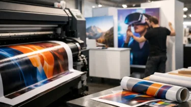
A stand can have the right footprint, lighting and product display, yet still fail to draw people in if the graphics are poorly planned. Exhibition graphics printing is what turns a structure into a clear branded environment – one that can be understood from an aisle, supports a sales conversation at close range and looks as good on opening morning as it did in the design proof.
For marketing and event teams, print is not a final decorative layer. It affects how confidently visitors recognise your business, how easily they find key messages and how well every part of the stand works together. The practical details matter too: the correct material, accurate sizing, venue-safe installation and a delivery schedule that leaves no uncertainty on build day.
What exhibition graphics need to achieve
Exhibition graphics have a different job from a brochure, website banner or office wall graphic. Visitors are moving, stands are competing for attention and viewing distances vary widely. A headline may need to be read from several metres away, while a product benefit or case study has to work when a visitor is standing directly in front of it.
The strongest graphics establish three things quickly: who you are, what you offer and why a visitor should stop. That does not always mean filling every available panel with information. In a busy hall, a simple message with confident branding often has greater impact than a dense collection of claims, logos and small copy.
Graphics also need to work with the physical stand. A message positioned across panel joins, behind furniture or around a screen can lose its effect, however good it looked in a flat artwork file. This is why stand layout, display hardware and print production should be planned together rather than handed between separate suppliers.
Choosing the right exhibition graphics printing format
The best format depends on the stand system, the event programme and how often the display will be used. A portable pop-up or tension-fabric backdrop has different requirements from a custom modular stand with rigid wall panels, overhead features and integrated storage.
Tension-fabric graphics for portable impact
Tension-fabric displays use printed textile graphics that stretch neatly over a lightweight frame. They offer a clean, contemporary finish without visible panel lines, and they pack down efficiently for transport and storage. This makes them a strong option for conferences, smaller exhibition spaces, roadshows and organisations that need a team to assemble a professional display without specialist tools.
Fabric is particularly effective for large visual areas, such as back walls, curved displays and meeting zones. It can also reduce the need for multiple rigid boards. However, the artwork still needs careful consideration. Text and logos must account for frame edges, zip closures and any curvature in the structure.
Rigid printed panels for structure and durability
Rigid materials are well suited to exhibition walls, product displays, directional signage and counter fronts. Foamex is a practical choice for many short-to-medium-term applications, providing a smooth printed surface at a manageable weight. DiBond offers greater rigidity and durability, making it useful where a premium, hard-wearing finish is needed. Acrylic can create a more polished appearance for selected signs, while Correx is a cost-effective option for temporary direction signs and short-duration promotional use.
Material selection is not only a visual decision. Consider how the graphics will be fixed, whether they need to travel repeatedly, the likelihood of handling during the show and where the display will be installed. A thin board may be right for an internal wall panel but unsuitable for a freestanding sign in a high-traffic area.
Replacement graphics for reusable stands
Reusable modular systems are often the most commercially sensible route for businesses with a regular event calendar. The hardware can be reconfigured for different stand sizes, while printed panels or fabric skins are replaced when campaigns, messaging or product ranges change.
This approach avoids paying for a completely new stand for every event. It does require discipline: retain accurate artwork files, label stored components clearly and plan replacements early enough for proofing and production. A reusable frame with out-of-date graphics can weaken the value of the original investment.
Artwork that survives the move from screen to stand
A polished design on a laptop is not automatically print-ready. Large-format artwork needs the right scale, resolution, bleed and colour management to reproduce consistently. Small images can look acceptable on screen but become visibly pixelated when printed across a three-metre wall.
Start with the final graphic dimensions and viewing distance. Large background images may not need the same resolution as close-viewed product imagery, but logos, fine type and technical diagrams need to remain crisp. Vector logos and high-resolution source files give the production team more control and reduce avoidable compromises.
Colour is another common source of disappointment. Brand colours should be specified clearly, ideally with recognised references where appropriate. Digital print processes, substrates and lighting conditions can all affect perceived colour. A graphic viewed under office lighting may look different under the bright, mixed lighting of an exhibition hall. Where colour accuracy is critical, a physical proof or sample should be considered before a full production run.
Keep key copy, logos and imagery away from trim edges, panel joins, fabric tension areas and doors. If a graphic wraps around a corner or is split across modular sections, the design needs to acknowledge that structure. This is particularly important for continuous images, maps, detailed product visuals and text-led campaigns.
Plan graphics as part of stand delivery
Print quality alone cannot solve a poorly coordinated event build. Exhibition graphics need to arrive in the right sequence, be protected in transit and be installed against the correct stand components. They may also need to be coordinated with electrics, flooring, internet connections, monitors, furniture and product plinths.
A practical programme begins with the stand plan and venue deadline. From there, confirm graphic dimensions, substrate, fixing method, artwork approval dates and production lead times. If installation is included, the build team should know which panels are numbered, which graphics are double-sided and where any cut-outs, sockets or screen apertures sit.
For larger or more complex stands, venue rules can influence the choices available. Height restrictions, fire ratings, loading times and access arrangements all need checking. Risk assessments and method statements may be required for installation activity, particularly where tools, lifting, electrical work or elevated elements are involved. Leaving these points until the final week creates pressure that no amount of good artwork can remove.
Trade Show Solutions manages the relationship between graphics, stand hardware, venue services and on-site installation, giving clients one accountable delivery route rather than a chain of disconnected suppliers.
Common mistakes that reduce graphic impact
The most frequent issue is trying to say too much. Exhibition visitors do not read a wall in the same way they read a report. Prioritise one main message, then use secondary information to support the conversation your team will have on the stand.
Another mistake is treating every surface as identical. A back wall, reception counter, meeting-room divider and hanging sign each have different viewing angles and practical demands. A counter graphic should not carry essential copy that is hidden when visitors gather around it, and a high-level sign should not rely on fine detail.
Late artwork changes also carry a real cost. They can affect proofing, print schedules, installation planning and courier arrangements. Build in an internal approval process that identifies who has final authority on copy, legal wording, brand compliance and product information. One clear sign-off point is far more reliable than a series of informal amendments.
Finally, avoid designing only for the photograph. A stand should look strong in event photography, but it also has to function for the people working and visiting it. Leave sightlines open, position messages around the customer journey and make sure the graphics support the purpose of the space, whether that is lead capture, demonstrations, meetings or a product launch.
A better brief produces better print
A useful exhibition print brief gives the production team more than artwork files. It states the event date and venue, stand dimensions, intended display system, number of uses, installation requirements, brand references and any non-negotiable messages. It should also identify whether graphics need to be stored, reused or replaced after the event.
That information makes it easier to recommend the right combination of fabric, boards, modular panels and signage. It also exposes potential issues early, before production begins and while there is still time to make sensible decisions.
The most effective graphics do not simply fill a stand. They make the space easier to recognise, easier to navigate and easier for your team to use. Give print planning the same attention as the stand itself, and build day becomes a controlled delivery task rather than a last-minute test of whether everything fits.