
Guide to Shell Scheme Graphics That Work
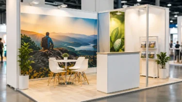
Shell scheme graphics have a difficult job. They need to turn a standard aluminium-framed booth into a credible branded space, often within a few square metres and before the show opens. This guide to shell scheme graphics explains how to plan, design and install them so the stand looks intentional rather than like a set of posters added at the last minute.
A shell scheme is a practical and cost-effective starting point for many UK exhibitions, particularly for first-time exhibitors, smaller spaces and events with standardised layouts. The structure may be supplied by the organiser, but the visual result is entirely down to how well the graphics are measured, designed and fitted.
Start with the shell scheme, not the artwork
The most common mistake is designing graphics before confirming what has actually been booked. Shell scheme systems vary between venues and contractors. A 3m x 3m stand describes the floor area, not necessarily the printable wall dimensions. Panel widths, heights, corners, door positions, fascia boards and the location of electrical sockets can all affect the final design.
Request the organiser’s shell scheme specification as early as possible. It should confirm the internal wall sizes, panel construction, fascia dimensions and whether graphics can be fixed directly to the panels. Some events use rigid infill panels within aluminium poles, while others use fabric or board systems with different fitting requirements.
A proper plan also accounts for the stand’s open sides. A corner plot has less wall space than a row stand but greater visibility from the aisle. An end-cap space may need its key message repeated on more than one elevation. It depends on where visitors approach from and whether the stand needs to support demonstrations, meetings or product display.
Check the usable graphic area
Do not assume every millimetre of a wall is visible. Uprights, crossbars and panel grooves can interrupt text, images and logos. Keep crucial copy and logo elements clear of these areas. If the organiser provides a technical drawing, mark the safe zones before artwork begins.
Fascia graphics deserve the same attention. The fascia is usually the first branded element visitors see from the aisle, especially in a busy hall. Use it for the company name, a short descriptor or a clear campaign message. It is not the place for dense copy, phone numbers or a long list of services.
Set a clear hierarchy for shell scheme graphics
An exhibition stand is read quickly. Visitors should understand who you are, what you offer and why they should stop within a few seconds. That calls for a simple visual hierarchy rather than trying to reproduce a brochure across three walls.
Lead with the brand name or logo at a height that can be seen above surrounding activity. Follow this with one strong message that states the commercial benefit of speaking to your team. Supporting information can sit lower down, where it is available to people already standing at the stand.
For example, a software business may use the main wall for a concise proposition, a side panel for three service areas and a third panel for proof points or a product visual. A manufacturer may instead use a large product image, a short performance claim and a focused call to action. The right approach depends on the sales conversation you want to start.
Avoid treating every panel as a separate advert. Graphics should work as one connected environment. Consistent background colours, image style, typography and spacing make even a modest shell scheme feel more considered.
Design for viewing distance
Type that looks generous on a laptop can be unreadable from the aisle. The largest message should be visible from several metres away, while smaller copy should only carry essential detail. If visitors need to stand close to a panel to understand the business, the stand is asking too much of them.
Large images can work well, but only when they are high resolution at full print size. A small web image enlarged to cover a wall will appear soft or pixelated. Supply original photography, properly prepared product renders or approved high-resolution campaign assets wherever possible.
Choose materials and fitting methods carefully
There is no single best material for every shell scheme. The practical choice depends on the panel surface, event duration, budget, whether graphics will be reused and the venue’s rules on fixing methods.
Self-adhesive vinyl is a popular option for smooth shell scheme panels. It provides a clean, close-fitting finish and can cover individual panels effectively. However, it must be specified correctly to avoid damage on removal or poor adhesion on textured surfaces. Removable adhesive vinyl is often suitable for short-term exhibitions, but it should always be tested against the actual panel type where possible.
Foamex or other rigid printed boards can be fitted to some systems using approved hook-and-loop tape or mechanical fixings. They give a crisp, solid finish and can be reused when panel sizes remain consistent. Their trade-off is transport and storage: large boards need protection, and a design tailored to one shell scheme layout may not fit the next event.
Tension-fabric graphics can create a more premium result when used with compatible frames or a stand build designed around them. They are lightweight, portable and straightforward to transport, but they are not automatically a direct replacement for shell scheme panel graphics. The structure and graphic dimensions need to be planned as one system.
Before production, confirm the organiser’s rules. Some venues prohibit certain tapes, adhesives and drilling. Others require flame-retardant certification for printed materials. Failing to check can leave an exhibitor with graphics that cannot be installed as intended.
Prepare artwork for large-format print
Artwork preparation is where many avoidable delays begin. Print files should be built to the confirmed panel dimensions, with bleed where required and a clear indication of which edge is top. Naming each file by stand elevation and panel position makes installation faster and reduces the risk of incorrect placement.
Use CMYK artwork unless the print supplier requests otherwise. Brand colours should be specified using recognised references where colour accuracy matters, particularly for corporate logos and campaign palettes. Screen colours are only an approximation of print, so a proof or colour check is worthwhile for high-profile events.
Keep vital text and imagery within a safe area. Bleed allows the print to trim or wrap cleanly, but it is not an area for anything critical. If a design crosses multiple panels, allow for the width of uprights and joints so faces, product details and wording do not split awkwardly.
A good production partner will check technical suitability before printing, but supplied artwork still needs a clear approval process. Confirm dimensions, spelling, contact details, QR codes, dates and stand number before sign-off. Reprints caused by a wrong telephone number or a missing character are expensive when the event is only days away.
Plan installation as part of the stand build
Graphics should arrive labelled, protected and sequenced for fitting. This matters most when there are multiple walls, board panels, counters and fascia sections to install. A simple plan showing each item in position saves time on site and keeps the build team moving in the right order.
Installation also needs to work around practical services. Electrical sockets may sit behind a graphic, cable routes may affect panel access, and hired furniture can obscure lower-level messaging. If the stand includes a screen, shelving, product plinths or a reception counter, establish their positions before finalising the artwork.
For exhibitors managing their own build, allow enough time to fit graphics carefully. Rushing adhesive vinyl onto panels can cause bubbles, wrinkles or misaligned joins. For a larger event programme, professional installation reduces the pressure on internal teams and provides one point of accountability for graphics, stand hardware, flooring, electrics and on-site coordination.
Trade Show Solutions can combine printed graphics with modular systems, portable displays and installation support, helping ensure that the visual plan works in the real conditions of the venue rather than only on a layout drawing.
Make the shell scheme work harder on the day
Once the walls are branded, the final details determine whether the stand feels open and usable. Keep the entrance clear, position a counter where staff can greet visitors without creating a barrier, and avoid filling every wall with text simply because the space is available.
If lead capture is the priority, use graphics to make the conversation easy to begin. A visible product benefit, a relevant industry challenge or a short invitation to see a demonstration is usually more effective than generic claims. If the objective is brand awareness, stronger imagery and a cleaner message may be the better use of the panels.
A shell scheme does not need to look standard. With confirmed measurements, purposeful artwork and a fitting method suited to the venue, it can become a polished branded setting that supports the sales team from the first visitor to the final pack-down.